Image
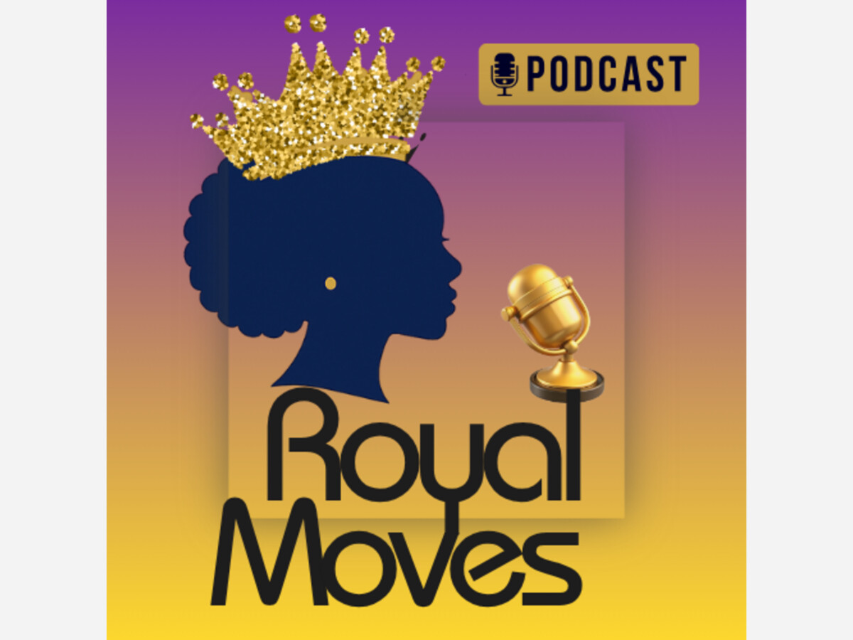

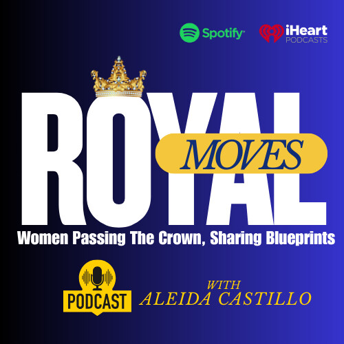
When I started the Royal Moves podcast, I knew the logo had to do more than look good — it had to feel powerful. The show celebrates Black and Brown women who lead with vision, grace, and strength, so the logo needed to reflect that same royal energy.
I began by asking myself: What do I want women to feel when they see this? The answer was clear — confidence, purpose, and elevation. That’s why I chose deep royal blue, gold on purple backdrop— colors that represent wisdom, achievement, and leadership, and power.
The crown became the central symbol. Not just any crown, but one that feels earned — representing women who’ve faced challenges, built empires, and are now helping others rise too.
I kept the design simple and elegant because simplicity makes a message stronger. I wanted the logo to look just as powerful on a podcast app as it would on a billboard.
For me, the Royal Moves logo is more than a graphic — it’s a reminder that every woman is capable of making her next move her royal one! I decided on a less busy more simple logo but kept all the regal colors! Now lets travel the world and meet some powerful women who want to share some royal moves!
Old Logo below!


Sunny, with a high of 99 and low of 69 degrees. Sunny during the morning, clear overnight.